 |
| InDesign Work
Menu- The Sandwich Shoppe
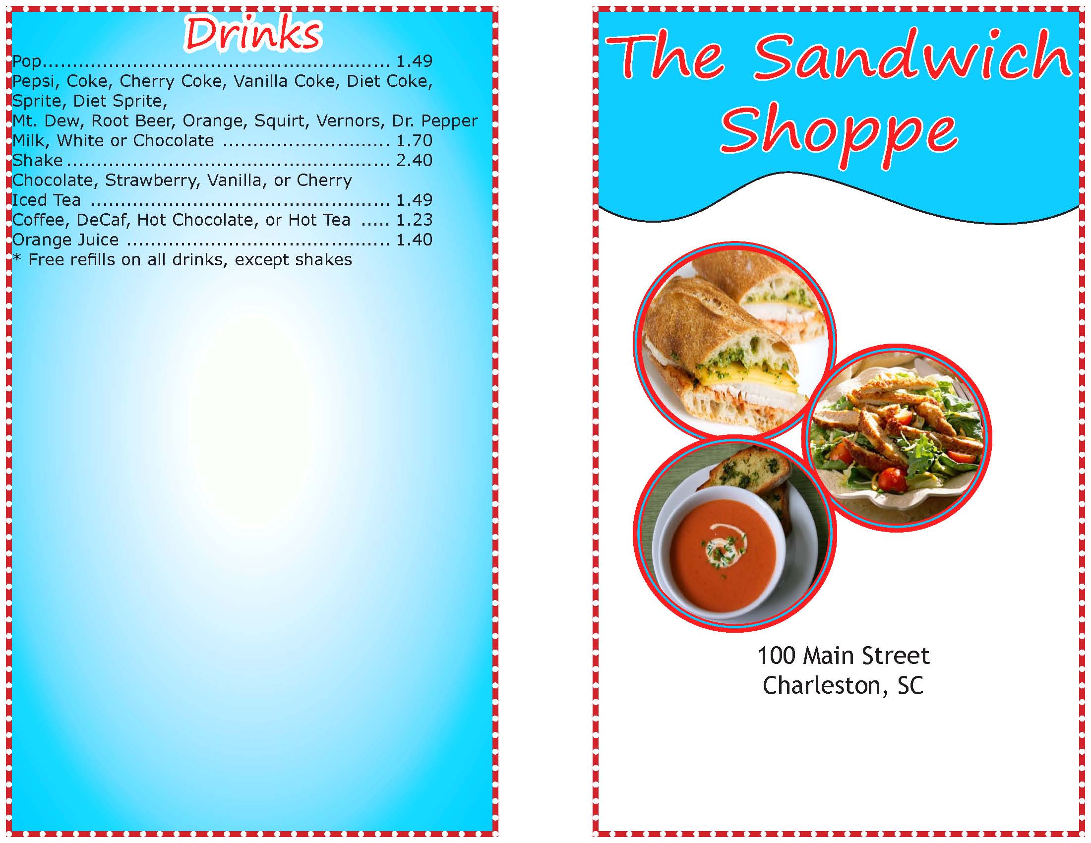
For my menu design, I chose a simple and classy look. I chose to put in appetizing pictures to attract the viewers, as well as using gleaming colors to catch the viewers eye. I used different tools in indesign to help make the title "pop" and stand out. I also used a creative border, which added to the classy but yet fun look. Also I chose to use different gradients for the background to make the menu look differently than others. All in all my menu design is simple and cute. It is always better to keep it cute and simple! :)
Logo - TD Associates
I chose to design my label to be simple but yet elegant. I wanted the label to easily relate to the company's name. They asked for a compelling logo that incorporated the agency's name and suggested their company's purpose of graphic design. My design incorporated the company's name along with a simple yet catchy logo. The logo is based upon the sun, which allows the customers to relate to the sun, which then relates to energy. I chose to use bright colors that would stand out amongst competetors as well as colors that closely related to the idea behind the logo. I believe my design fits the owner's description perfectly.
Calendar- Humane Society
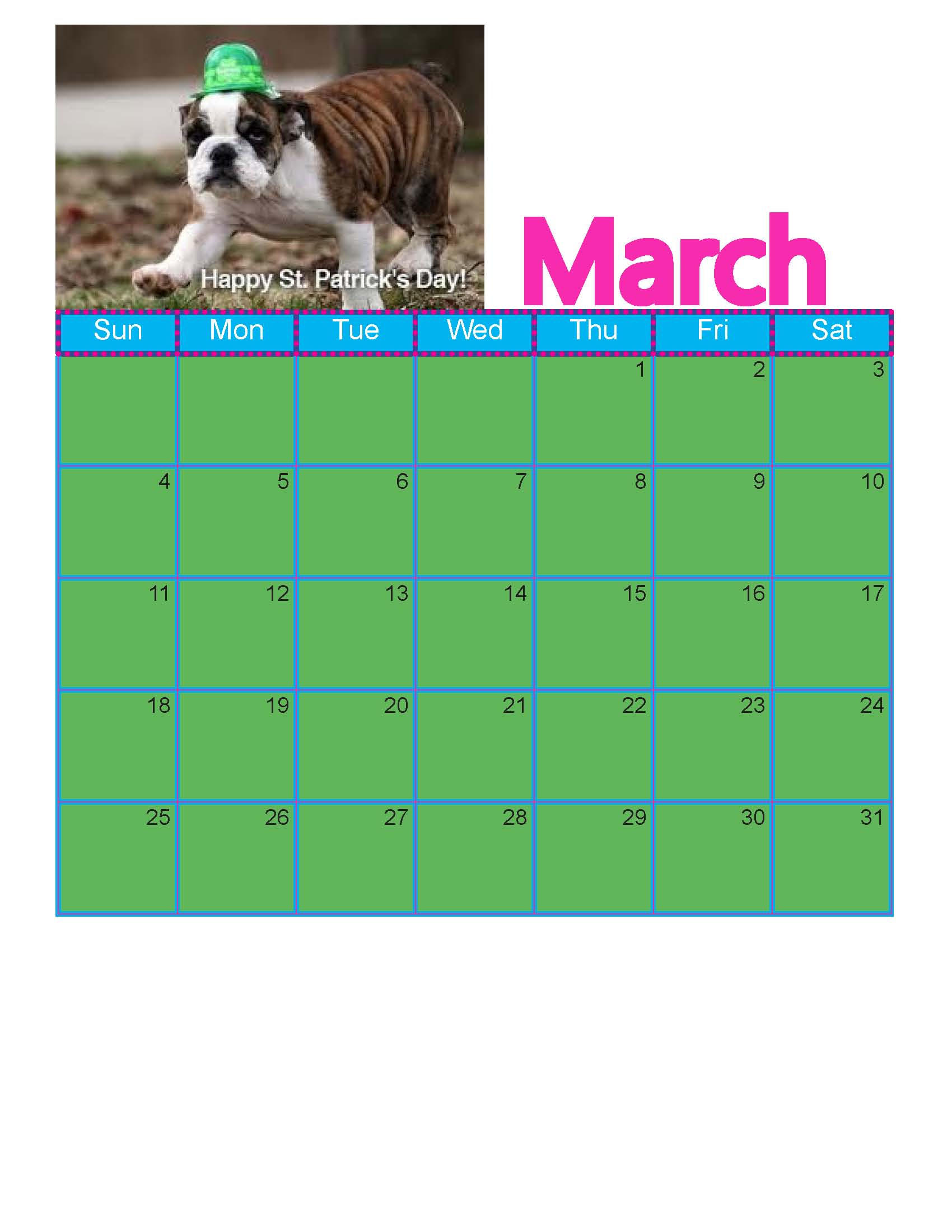
I designed my calendars to be bright and fun, and themed along with the seasons. I chose animals that were cute and would be appealing to the targeted audience. The color schemes that I chose related directly to the month. For example, the month of March I chose a green display to relate to St. Patricks day, as well as choosing a photo of a dog dressed for St. Patricks day. I laid out the page so that the picture and calendar itself were the main components. I chose a simple text throughout the whole page to create an easy and smooth look.